
Driefcase is an ABDM-approved smart health document locker that securely stores, organizes, and shares personal and family medical records with ABHA integration.
Why Redesign?
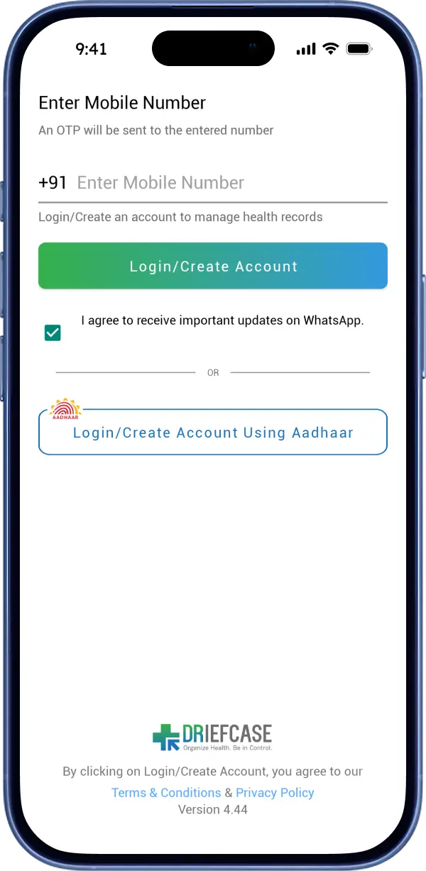
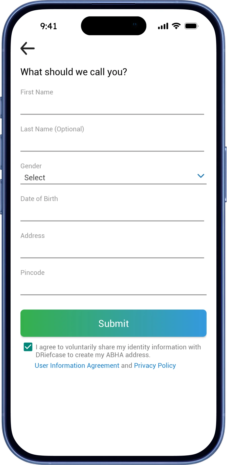
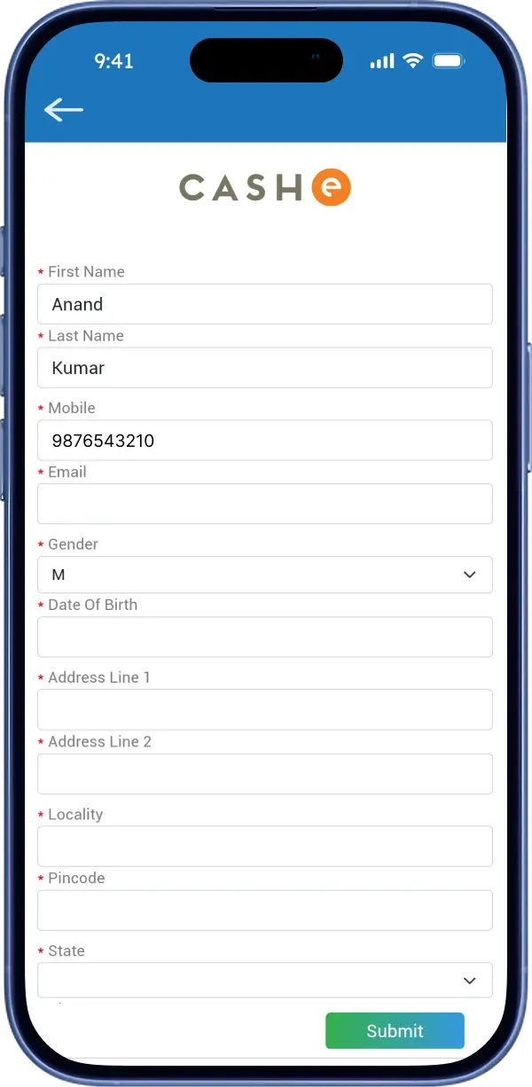
Onboarding flow is overwhelming and is not user friendly.
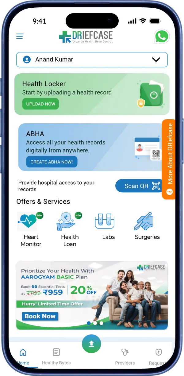
The homepage reflects outdated 2015 UI Trends.
Most of the pages has major UX flaws.
App is not engaging & users tend to use it occasionally.
What can be improved?
Simplify onboarding and make it welcoming for users.
Reduce visual clutter with simple & concise layout.
Resolve critical UX problems across all pages.
Introduce features that keep users engaged while aligning with the business goals.
Participants
Age Group
Platform
✔
User can perform task quickly, without any trouble.
!?✔
User can perform task, but has some struggles.
✖
User can't perform task.
Key Insights
The following data represents the outcomes of Guerrilla Usability Testing.
Create an Account
38% users were unable to create their account.
Add a New Member
38% users struggled while adding a new member.
Add a Document
63% users struggled while adding & uploading a document in Health Locker.
Book a Lab Test
50% users were not convinced to choose among several test packages.
Apply Health Loan
38% users did not fill out the loan form or abandoned it in between.
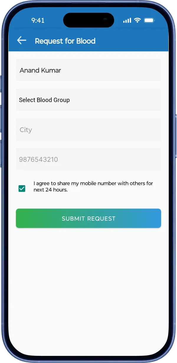
Check Blood Availability
50% users were unable to get details about nearby blood availability.

Onboarding
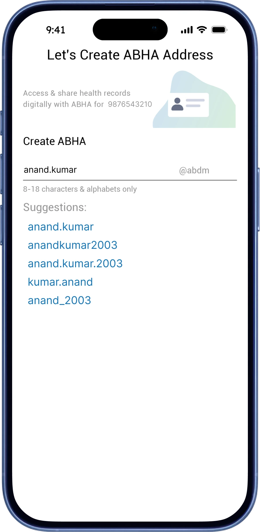
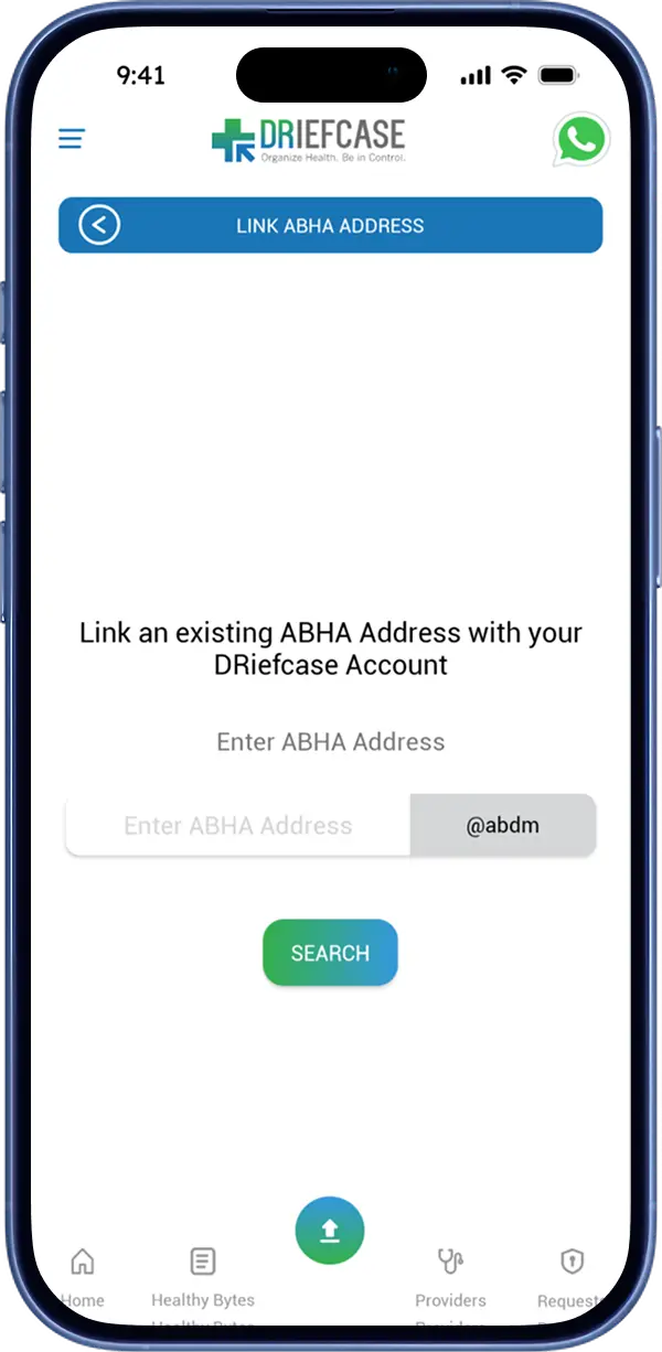
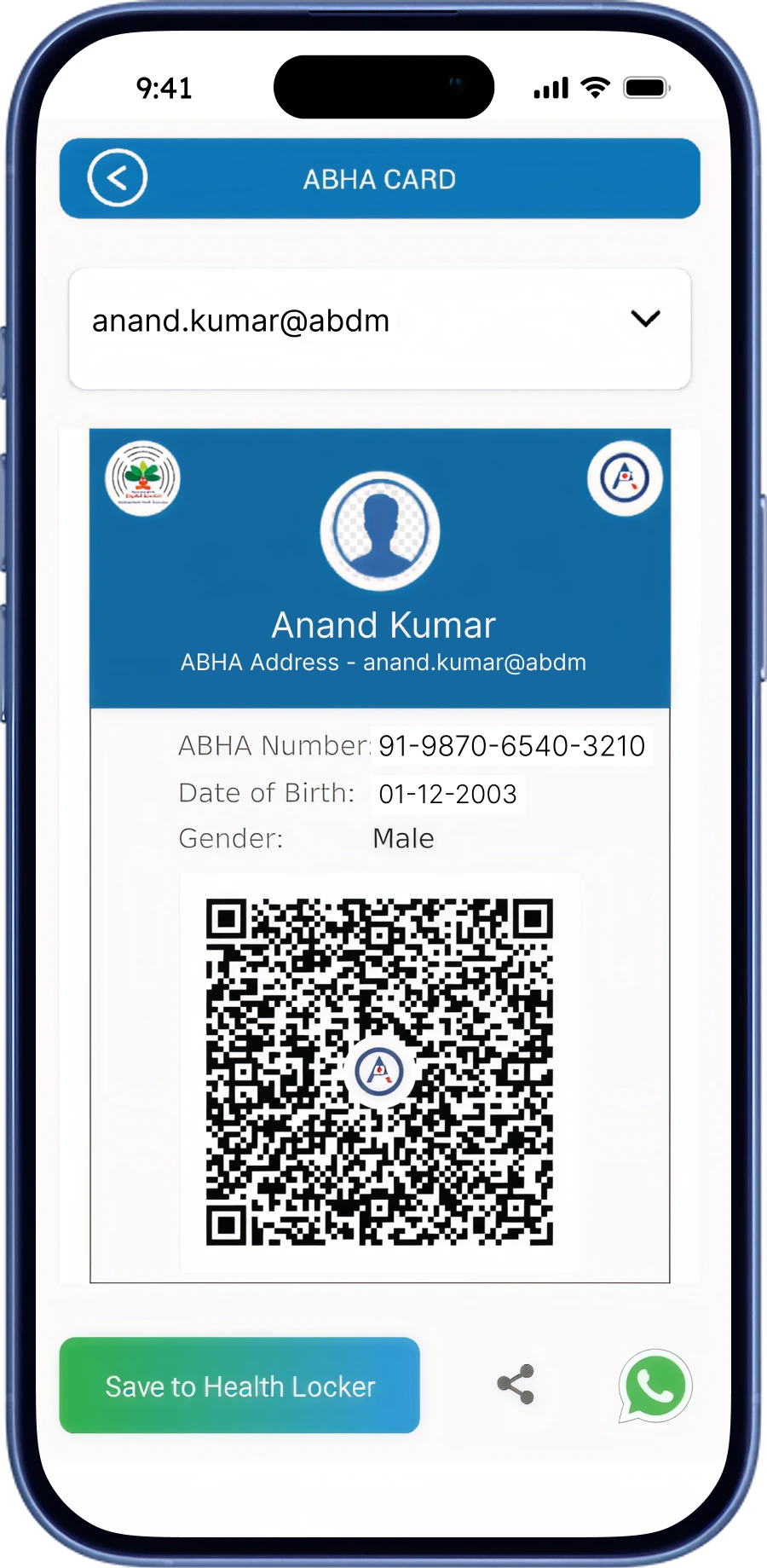
There is no option to link existing ABHA ID while onboarding.
Lab Test
Multiple packages are shown, all at once.
Users having difficulty deciding a suitable.
Health Loan
Users seems to be overwhelmed with the lengthy form.
Many users dropped off the form midway.
Health Loan
Those who applied are unable to track their application status.
Blood Availability
Users can't check for real-time blood stock.
Users are waiting for response after raising a request.
Major Problems Observed
Overall experience is overwhelming & forms are time-consuming.
No onboarding flow for users with existing ABHA ID.
No real-time data on blood request & availability.



Gem-based Reward System
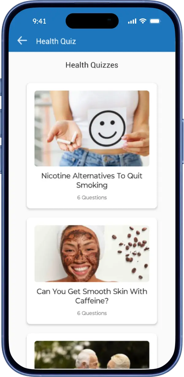
The primary goal of this feature is to increase general health literacy & awareness among users. It focuses on incentivizing continuous learning with rewards like Discount Coupons, Gift Cards & Exclusive Health Benefits which will potentially increase user retention.
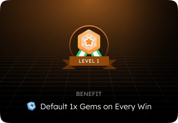
Higher Level = Bigger Rewards
This is highly effective progression-based reward loop, often called a "loyalty loop". As users achieve higher levels, higher the reward becomes.
Why This Structure Works?
The Sunk Cost Effect: The more time & effort a user invests into reaching Level 5, the less likely they are to abandon the progress. They don't want to "waste" the high-earning status they earned.
Escalating Endorphins: Fixed rewards eventually become boring (e.g., getting 10 gems every single time). Increasing rewards match the user's time & efforts they invested to achieve the high-earning level.
Information Architecture
Home
Health Quiz
Live Quizzes
Already Played
Quiz Window
Quiz Results
My Rewards
Reward Store
Gems Wallet
Intro Drawer
Screen
Pop-Up
Action
My Learnings
Reducing clutter and prioritizing instant search taught me that reducing cognitive load matters more than aesthetics.
Analyzing 200+ raw user reviews taught me how to filter noise and translate real user frustration into precise, prioritized design fixes.
The broken ABHA ID onboarding proved that neglecting edge cases can entirely halt a flow & can ruin user retention.
Therefore, Your feedback is valuable.


CASE STUDY
Jasnify
2026
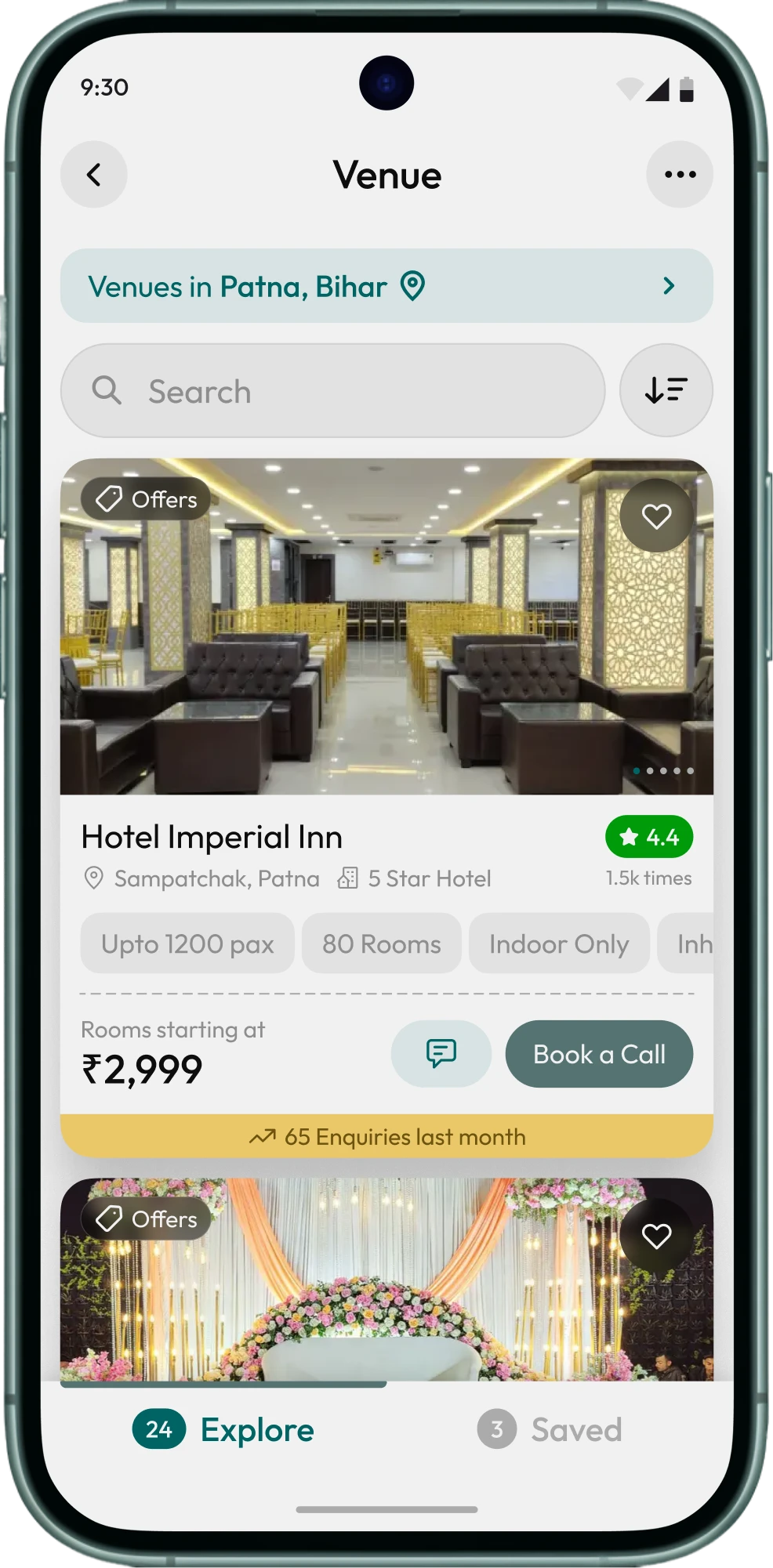
An all-in-one event planner app that lets you manage any kind of event efficiently. Key features include Budget Tracker, Venue & Vendors, Inspirations, Checklists, & much more.
